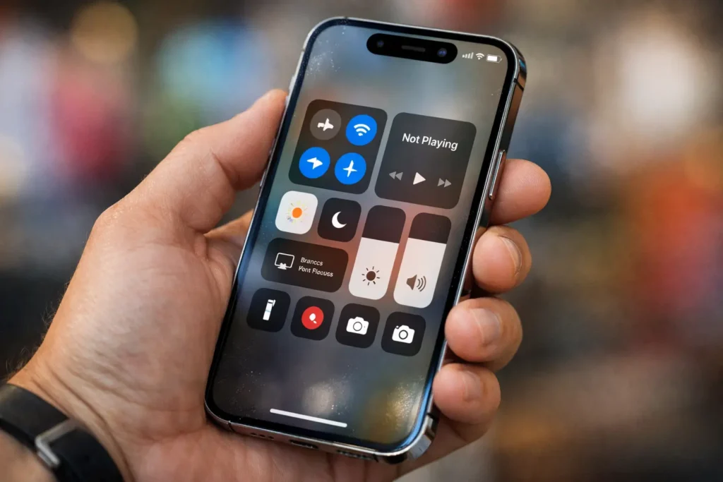
Android users may not get to joke about Apple’s controversial Liquid Glass look for much longer. Reports based on internal Android 17 builds shared by 9to5Google suggest Google could add more blur and transparency across parts of the Android interface.
Instead of sticking to fully solid light or dark panels, Google may shift some menus to semi-transparent backdrops. That change would let you see a softened version of whatever sits behind a menu—your app content, wallpaper, or home screen icons—creating a visual style that feels closer to Apple’s “glass” approach.
Where Android 17 may add blur and transparency
According to the report, Android 17 could apply this effect to several familiar UI areas, including:
- Volume controls, especially the pill-shaped container around the slider
- Mode switcher elements
- Home screen menus, where wallpaper and app icons may remain faintly visible behind panels
- System overlays like the volume panel and power menu, which may use blurred, translucent backgrounds
The report also suggests Android may tie the intensity or tone of the blur to Dynamic Color (Material You), so the UI could adapt its shades based on your theme. It’s still unclear whether Google will extend the same transparency style deeply into third-party apps.
Smaller change than iOS, but similar direction
Even if Android 17 doesn’t overhaul visuals as dramatically as Apple did between iOS 18 and iOS 26, the direction looks familiar: Google may prioritize a more “glassy” aesthetic with modern blur layers and see-through UI surfaces.
The big concern: legibility
Transparency can look premium, but it can also reduce clarity. When backgrounds compete with text and icons, people may squint more and tap less confidently. If Android 17 pushes blur too far, Google may need follow-up tuning—stronger contrast, smarter blur strength, and clearer accessibility defaults—to keep the interface easy to read.
Eco-friendly note for a greener UX
A clean, readable interface can also support eco-friendly product design in a practical way: when users navigate faster and make fewer mistaken taps, they spend less time repeating actions and keeping the screen active unnecessarily. Pairing transparency with strong readability controls (contrast, reduce transparency options, and accessible themes) helps deliver a modern look without sacrificing comfort—or efficiency.


